
Published on 24/09/2022 by Jay Kim
This case study outlines the end-to-end design process of MVP scoping, concept testing, designing, and launching the Monash mobile app.
When I joined Monash, the mobile team was just a small group of developers, including a few current Monash IT students. The team had been established by one of the directors in the Digital Department to bring his vision to life. He provided a broad range of feature ideas for the new app — from something as simple as a campus shuttle bus timetable to something as significant as enrollment functionality.
At the time, the app’s front-end was already in development, showcasing concepts like assessment reminders, grades, unit information, and more. However, the availability and structure of the underlying data were still unclear.

The team needed to make an informed decision about where to focus for the app launch—it was time to shift from concept to product. My first mission was clear: to discover what truly matters to Monash students and what is realistically achievable for the team in time for the launch.
Discovery
Semester journey mapping workshop
To truly understand the challenges students face each semester, I asked current Monash students to break down a semester into key stages and list the typical activities at each stage. I then asked them to explain how they personally complete each activity.
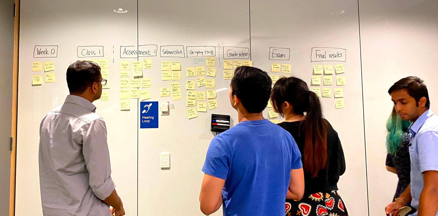
For example, when it comes to tracking assessment due dates, some students with fewer assessments found that adding deadlines to their Google or Apple calendar worked well. On the other hand, students managing a larger number of assessments found this setup tedious and preferred simply printing out a list of due dates.
Hearing about these workarounds gave me valuable insight into just how unsatisfied students are with the current process and highlighted what the system at Monash is missing.
Impact analysis
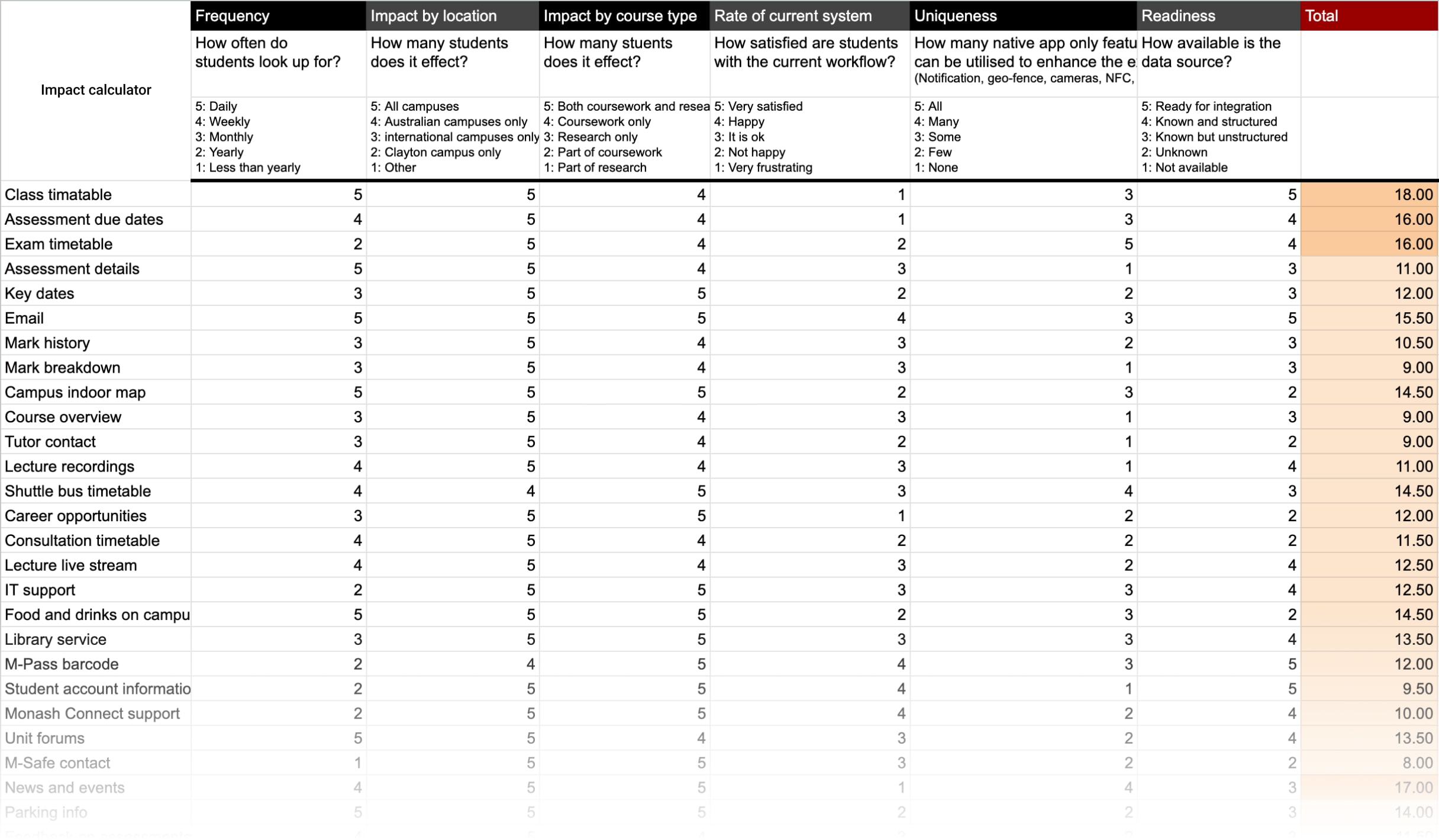
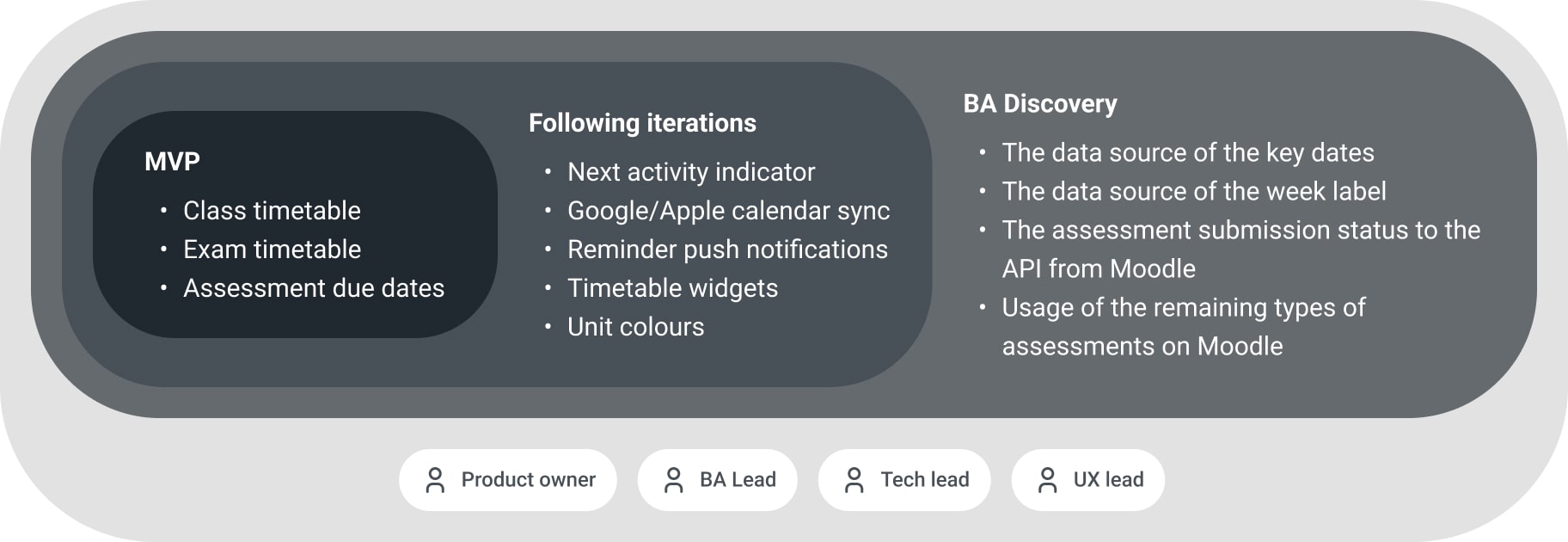
The results of the workshops highlighted where the key pain points were and how desirable potential solutions would be. This provided the team with a valuable starting list of features. To define the MVP for the app launch, we needed to further refine this list by assessing both feasibility and impact, allowing the team to prioritise effectively.
For the feasibility check, the mobile development team and I reviewed each item to determine how ready the necessary data was to support the feature. Unfortunately, some highly desired features—like the assessment weight breakdown—were unlikely to be available in the near future. These features required significant changes to the workflow on the teaching staff’s side to first clean and structure the data. We decided to set aside these long-shot features as future action items to address with the relevant stakeholders.
When it came to estimating impact, we aligned on two key criteria: how broadly each feature would affect the user base and how frequently each feature would likely be used.
Scale by study type
How many students does this feature affect?
5: All types
4: All coursework students
3: All research students
2: Some coursework students
1: Some research students
Scale by geometrics
How many students does this feature affect?
5: All campuses
4: All Australian campuses
3: Malaysian campuses
2: Clayton campuse only
1: Other
Frequency
How often do students look up this information?
5: Daily
4: Weekly
3: Monthly
2: Yearly
1: Less then yearly
Uniqueness
How many mobile features can be utilised?
(e.g. camera, NFC, notification, widget, geo-fence)
5: More than 4 features
4: More than 3 features
3: More than 2 features
2: At least 1 feature
1: None
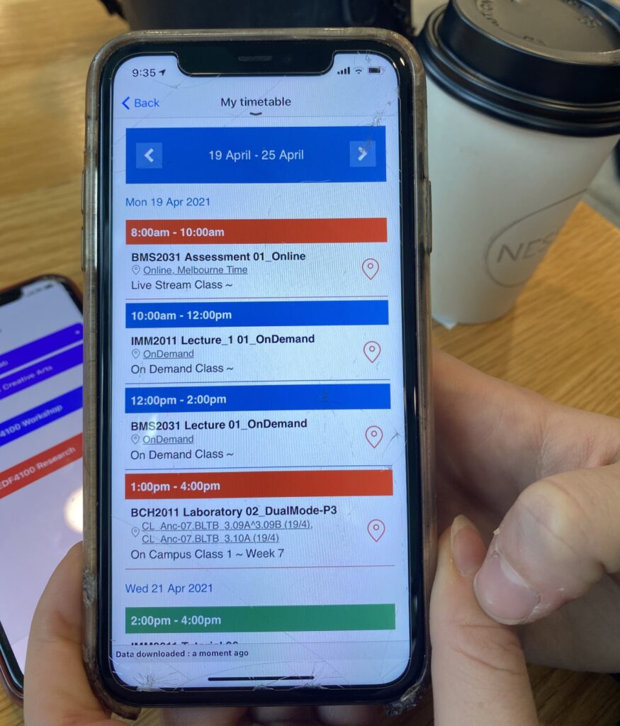
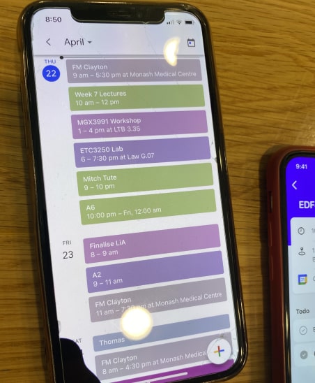
Timetable: The best impact with the least effort
The analysis quickly revealed a clear opportunity for the mobile app: to become a one-stop hub for managing daily schedules. This emerged as the most consistently frustrating task that coursework students faced several times a week.
High
Desireness
- The satisfaction rate on the current timetable system is low.
- Time and effort are high to workaround the shortcomings of the system.
High
Impact
- It will benefit 48% of Monash students across Australian and Malaysian campuses.
- Repeated usage is expected across all weeks throughout a semester.
High
Readiness
- The class timetable from the Allocate+ API is ready for integration.
- The personalised assessment list is available in the Student API, which is already integrated with the app for Profile.
High
Uniqueness
- Quick authentication process with biometric login
- Notifications as a reminder of assessment submission.
- Widgets as a glance at daily activities.
The current landscape
I set up a quick interview station with a “Free Coffee” sign at a popular campus lunch spot where students from different faculties often gather. After speaking with more than 20 students, I began to notice clear patterns emerging around what the current system is missing.
😡
Scattered information sources
• Class and exam timetables on Allocate+
• Assessment due dates on Moodle
• Key dates on the Monash website and emails
😡
Manual integration
• Manual entry to integrate with a personal calendar
• Manual reminder setup per event
• Repeatative set-up every semester
• Efforts to keep it up-to-date
😡
Short logged-in session timeouts
• Session expires multiple times a day
• No biometric options to a quickly login back
Design
Rapid design iterations
Based on the feedback about the current timetable experience, I’ve created a quick mockup to test out some ideas, and ran multiple rounds of guerrilla testings.
Key test findings on iteration 1
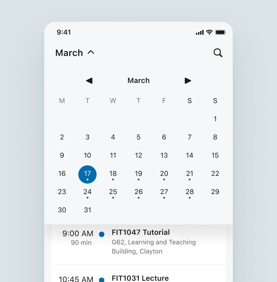
A weekly view aligns better with students’ mental models than a monthly view.
Class location information quickly becomes irrelevant, as most students remember where their classes are by around week 3.
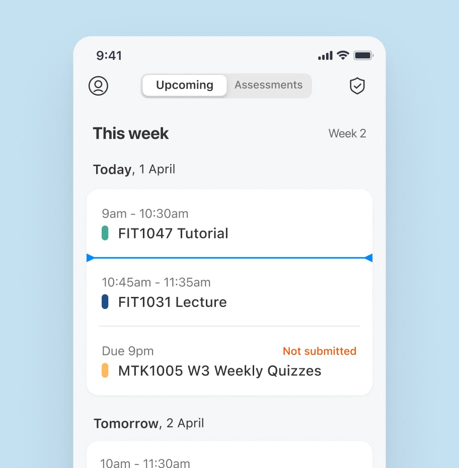
The exact end time of an activity is just as important as the start time, as it helps students plan their break durations.
The assessment submission status needs to clearly indicate whether the final action—submission—has been completed before the due date.
Key test findings on iteration 4
Over time, quick access to all assessments becomes more valuable to students than the class timetable.
Colours are commonly used to represent different units.
Key date announcements from the university are often ignored as spam because they aren’t personalised.
Students frequently mentioned wanting the ability to add custom items to their schedules.
Week labels are used as key anchors to help students navigate through the semester.
Technical and business considerations
To incorporate technical and business perspectives into the design, I shared the test findings with the development team to kick off the discussion. This allowed the team to explore implementation approaches, estimate effort, and plan how to divide the work, which then shaped the iteration plan. The design was finalised after integrating these insights.
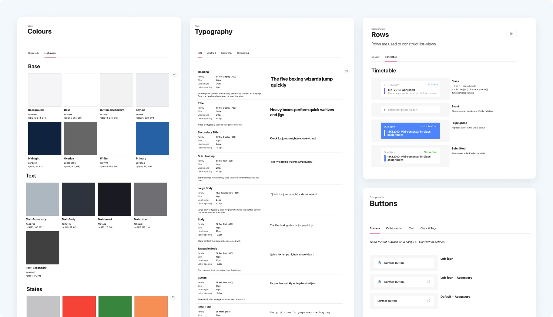
Design system update
When I took over the work, the app already had a design system in place, originally suggested by other Monash designers who primarily focused on web products. I collaborated with them to reach a shared understanding that each platform should have its own tailored design system to fully leverage its strengths, while still adhering to a unified brand-level design language.
I developed a gradual design system update plan and created Jira tasks to progressively transition to the new system.
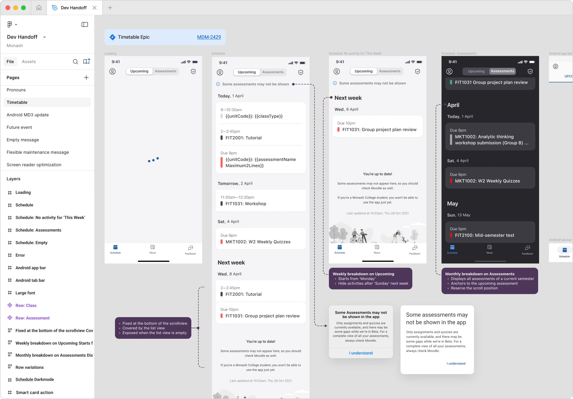
Dev handoff
I prefer maintaining two separate design files: one for design explorations and another dedicated to developer handoff. The developer handoff file serves as the visual source of truth aligned with the acceptance criteria detailed in Jira tickets, providing a clear reference for developers and business analysts.
I manage this handoff file strictly, ensuring any changes are carefully tracked to avoid confusion about the scope of work. It also includes user flows and UX notes to remind the development team of detailed design requirements.
App launch
For months leading up to the app launch, we closely collaborated with the Student Communications team, the Content team, and the Media team at Monash. Together, we prepared advertising materials and developed a comprehensive communication plan to promote the app across existing channels.
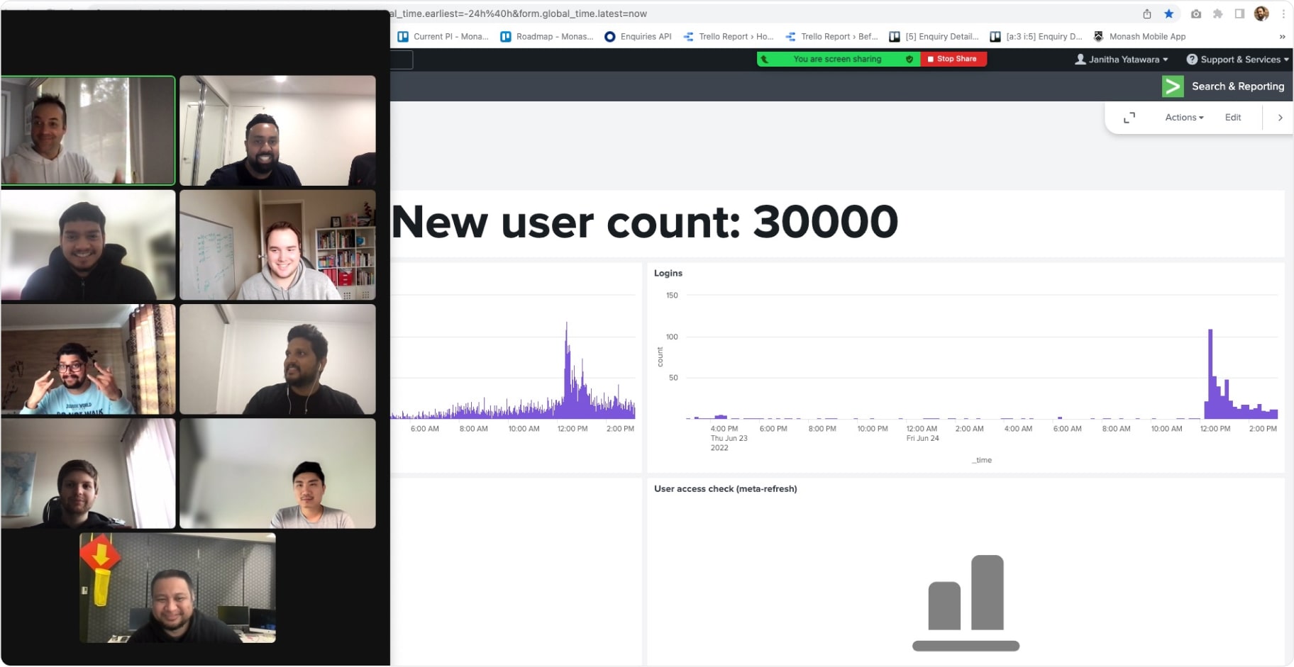
The launch was a great success, with a steady stream of new users joining every day. User retention, session numbers, and app ratings on both the App Store and Google Play surpassed our expectations. It was incredibly rewarding to see users genuinely finding real value in the product.
Post-launch
Roadmap adjustment
After launch, we revisited the roadmap based on user feedback and data insights to ensure our priorities aligned with real user needs.
For example, one recurring piece of feedback was about the colours used on the timetable. Initially, this was considered a lower priority for the launch and was scheduled for a later iteration. However, the colours were unexpectedly misinterpreted by some users, leading to confusion. Based on this, the team decided to fast-track the update and release it earlier than originally planned.
Rather than rigidly sticking to the original roadmap, we embraced feedback and quickly adapted our priorities to better serve our users. It reinforced our shared commitment to continuous improvement and delivering meaningful value through the app.